
Arun PK
CircularSlider
A highly customisable circular slider written in QML.
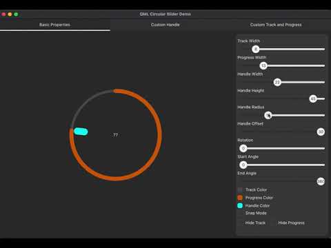
List of properties
- trackWidth
- progressWidth
- handleWidth
- handleHeight
- handleRadius
- handleVerticalOffset
- startAngle
- endAngle
- minValue
- maxValue
- value
- angle [readonly]
- capStyle
- trackColor
- progressColor
- handleColor
- stepSize
- snap
- handle [Component]
- pressed [readonly]
- hideTrack
- hideProgress
- interactive
- cursorShape
It is also possible to do advanced customisation by hiding the track, progress and provide your own visualisation for the custom track and progress indicators. Also possible to provide your own custom component as a handle for the slider.
Added support to hide handle and use Slider as a progress indicator by setting property interactive to false.
Added support to set custom cursor shape for the Slider handle.
Licensing
This QML component is licensed under the MIT License Agreement
Details
Source Repository: https://github.com/arunpkqt/CircularSlider
Latest Release: https://github.com/arunpkqt/CircularSlider/releases
Blog Post: Arun's Qt Corner - Circular Slider Blog
Screenshots
Basic Properties

Custom Handles

Custom Progress Indicator

Slider as Progress Indicator
